
Brand identity / Website design
How do you take an emerging children’s health venture from zero to one?
- Role
- Founding designerOngoing
- Scope
- Website & identityAudience strategy with the founder
- Collaboration
- Founder & growing team
- Context
- Children’s healthEarly-stage venture
TL;DR
Hlty Beings is an early-stage children’s health venture building screen-free stories, games, and experiences around healthy habits. As its founding designer, I designed the website and identity, and worked with the founder to shape its positioning, audiences, and offering concepts. The website needed to connect a varied product range to a shared purpose and address families directly while the team explored institutional channels.
What I owned
- Website
- Information architecture, audience routes, page content, homepage iterations, and handover to development.
- Shared strategy
- Audience and channel strategy, preventive-health positioning, and offering concepts with the founder.
- Team
- Helped build the team and guided designers as they joined Hlty.
- Identity
- The brand identity and guidelines that supported the venture’s visual direction.
01 / The problem
Find a place for health in everyday life.
In 2016, 74% of students aged 11–17 in India did not get enough physical activity. India’s 2016–18 nutrition survey also found that around 1 in 10 children aged 5–9 had blood glucose in the prediabetic range, and 1 in 3 had elevated triglycerides.
Hlty wanted children to engage with health before a diagnosis made it urgent. That meant making its connection to everyday life understandable: how eating, moving, and resting contribute to feeling well. Educational books and games offered a familiar way to explore those ideas through stories and play.
But leading with childhood obesity, the venture’s initial focus, left a gap: why would a company focused on one condition make books and games?
I proposed leading with everyday health and habits so the website’s message reflected what the books and games were meant to help children learn and practise. Preventing lifestyle disorders remained the broader ambition, but I wanted families to engage through curiosity and participation, without fear of illness as a motivator.
02 / Audience & information architecture
Prioritise parents while exploring other channels.
We were exploring direct sales to families (D2C), institutional sales (B2B), and partnerships that could reach families through another organisation (B2B2C). The revenue model was still taking shape, so the website needed to keep a direct relationship with families open while giving schools, clinics, and workplaces a way to explore working with Hlty.
Parents became the primary audience because they were closest to a child’s everyday life. Their route needed to show what their family could actually use. For Parents made that priority visible in the navigation. Get Started introduced four routes for parents, education, clinical care, and workplaces, so institutional visitors could assess how Hlty might fit their setting.
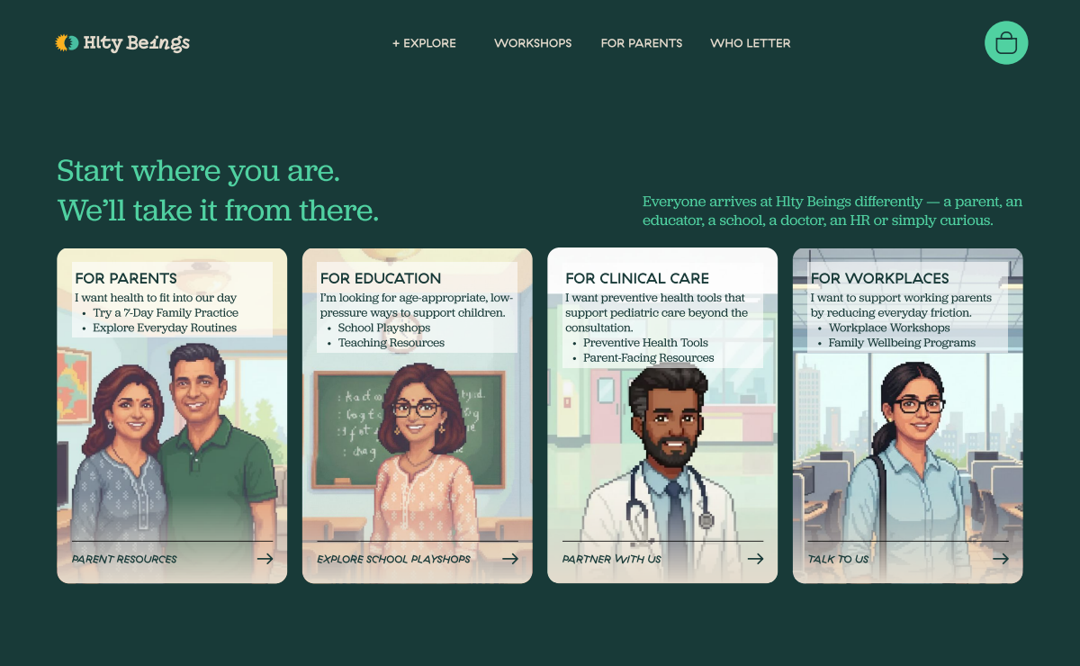 Primary audience
03 / Homepage hierarchy
Connect Hlty’s ambition to what families could use.
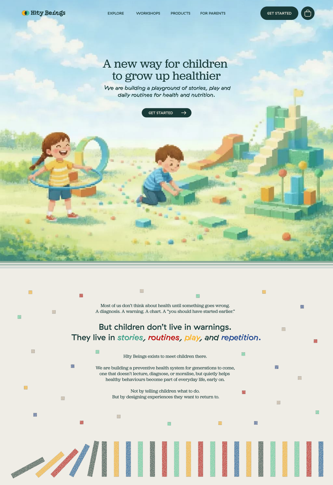
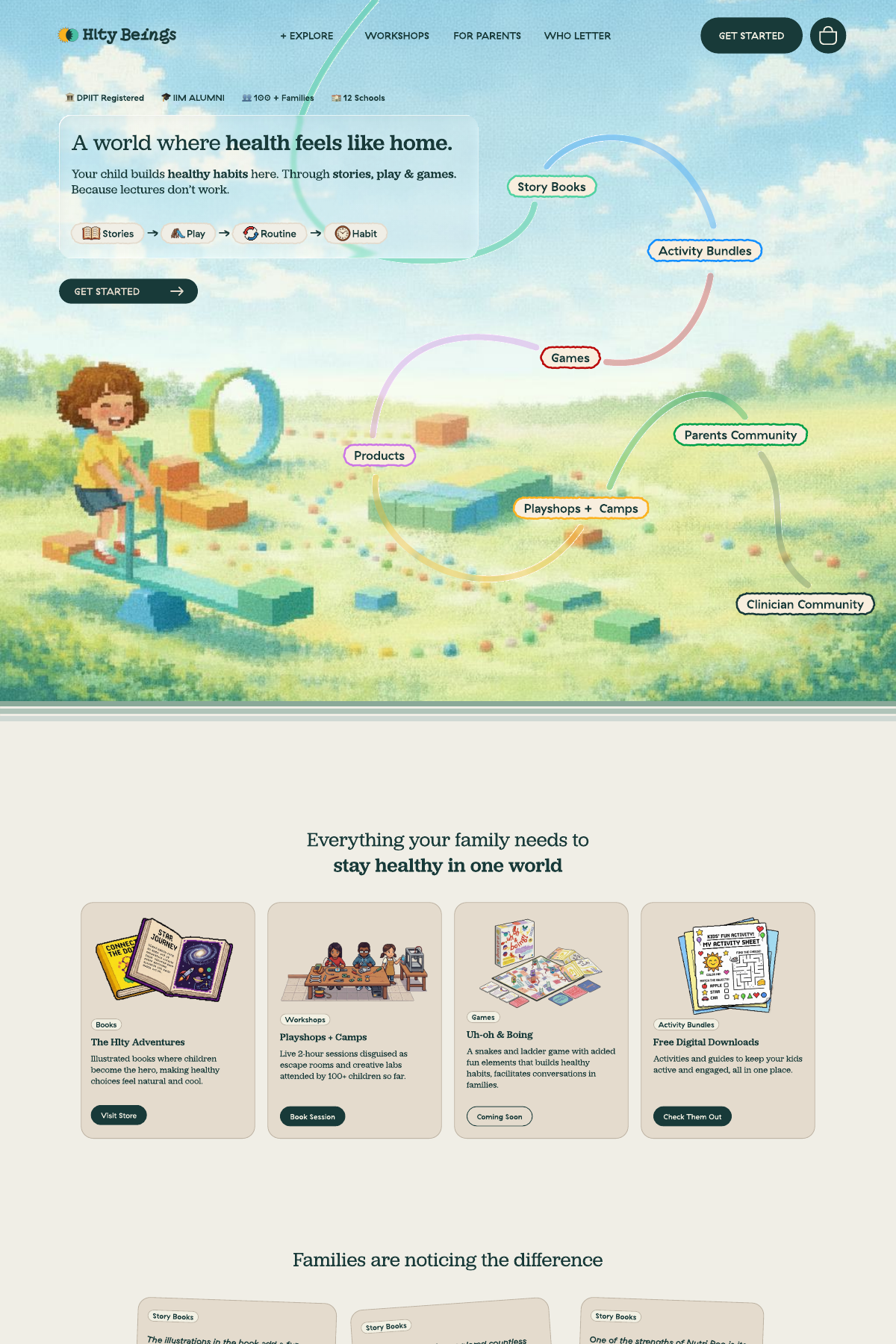
Families needed to picture something they could use. Partners and investors needed to understand how those individual offerings added up to a venture. In one exploration, the homepage moved from the hero into an extended explanation of Hlty’s approach. The selected direction brought product examples closer to the opening, giving visitors something concrete to assess before the fuller narrative.
04 / Brand & visual direction
Balance across products and identity.
I believe a healthy life should have room for the things that bring us joy. Health isn’t binary, and I wanted Hlty to encourage balance in everyday choices. That belief mattered to the products too: learning about health could involve effort and serious information while still being enjoyable. We wanted to work in that space between play and toil.
The visual language needed to hold those qualities together. Structure would give the information clarity; play would bring the curiosity and enjoyment we wanted children to associate with health. The overlapping sun and moon made balance part of the identity, while the wordmark paired structured lettering with playful movement. The guidelines gave designers joining the team a common reference for that balance. They were used to develop the brochure and doctor catalogue.
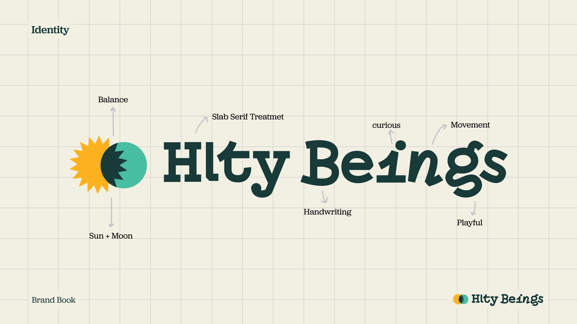
The identity: balance, curiosity and movement 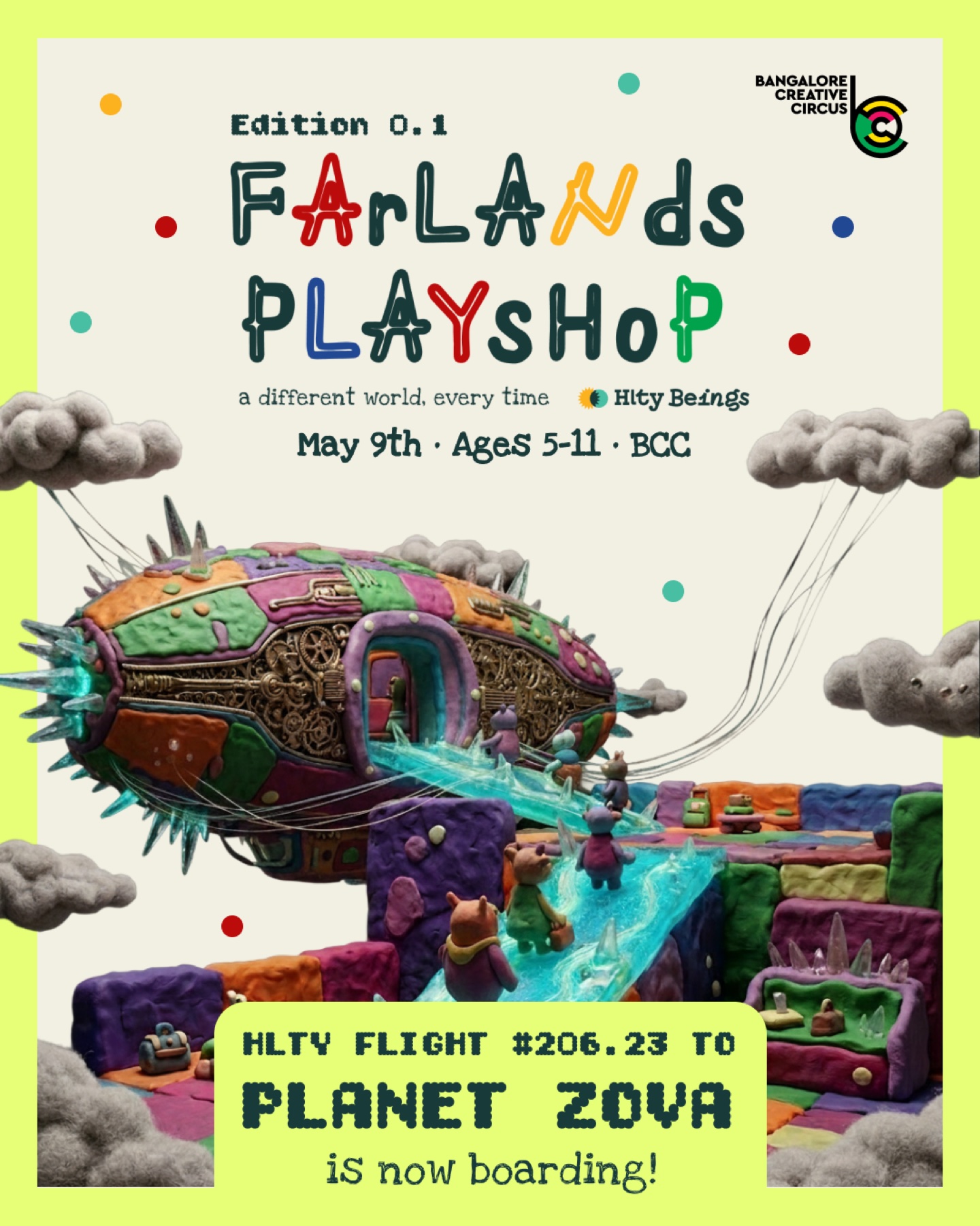
Farlands: a boarding announcement 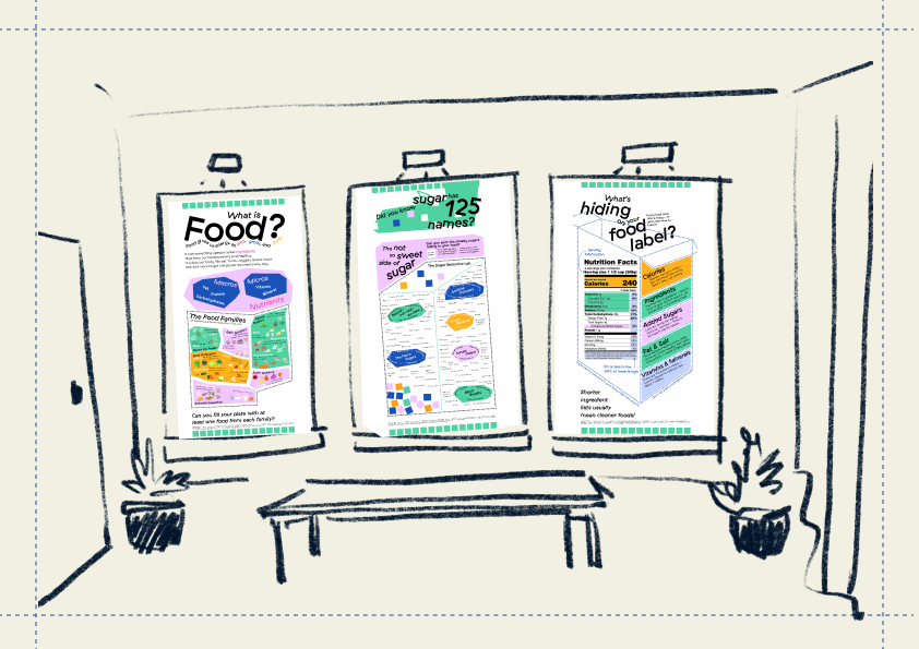
Clinic application: learning in shared spaces 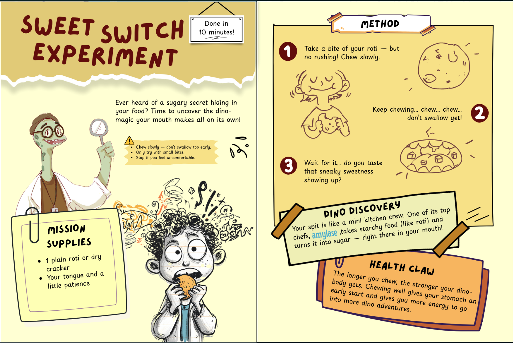
Science experiment book built with team. 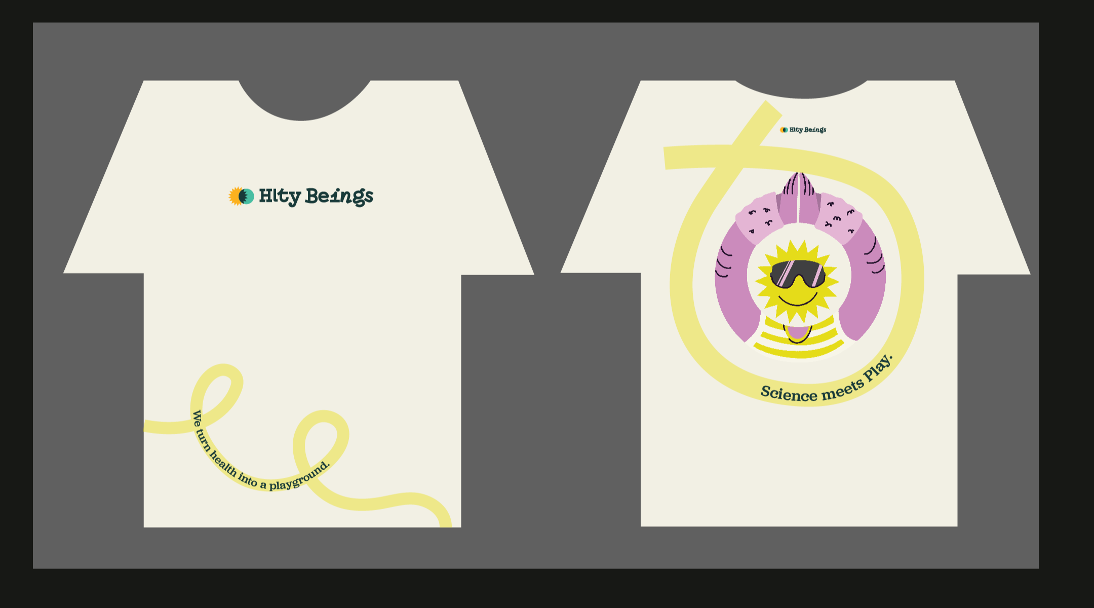
Merchandise: light T-shirt designs 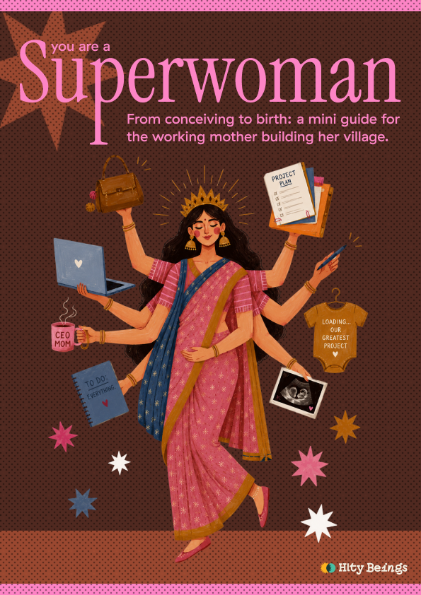
Resource cover: building a village 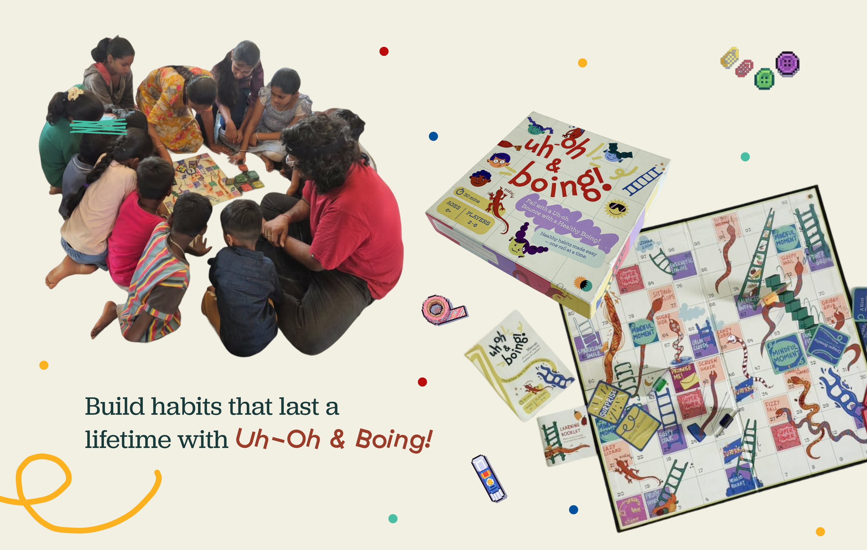
Game communication: showing shared play 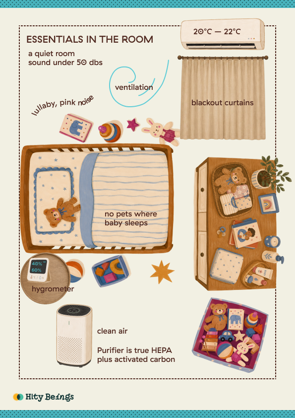
Sleep Hygiene Kit: room essentials 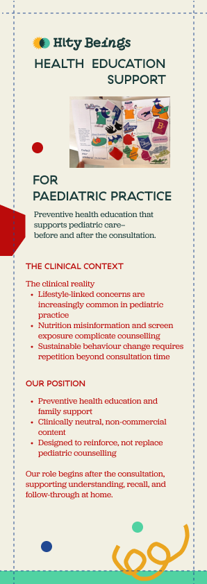
Clinical communication 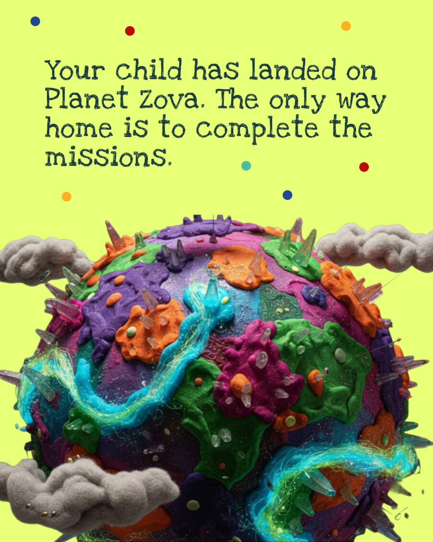
Farlands: introducing Planet Zova 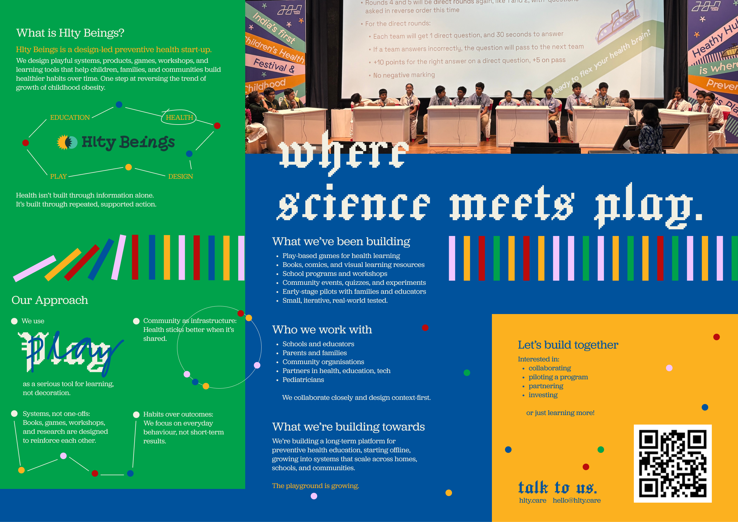
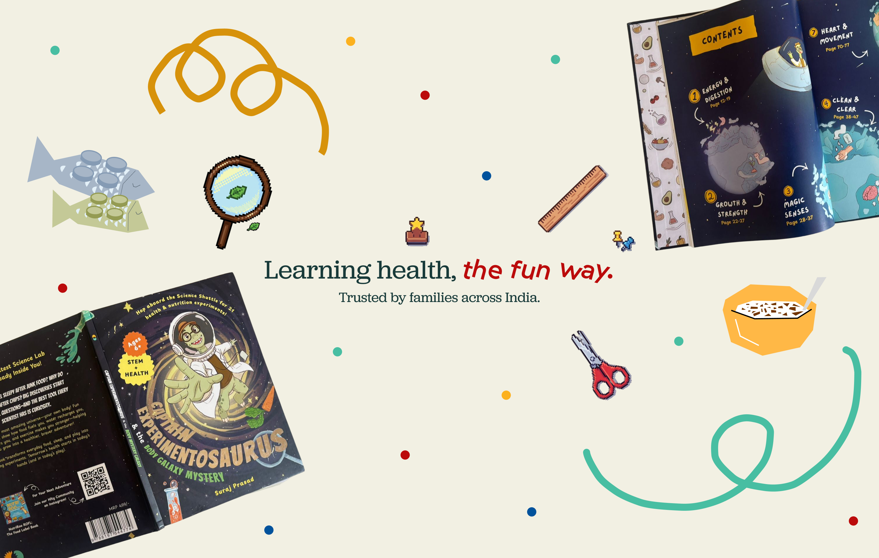
Brand communication: connecting the range
Book communication 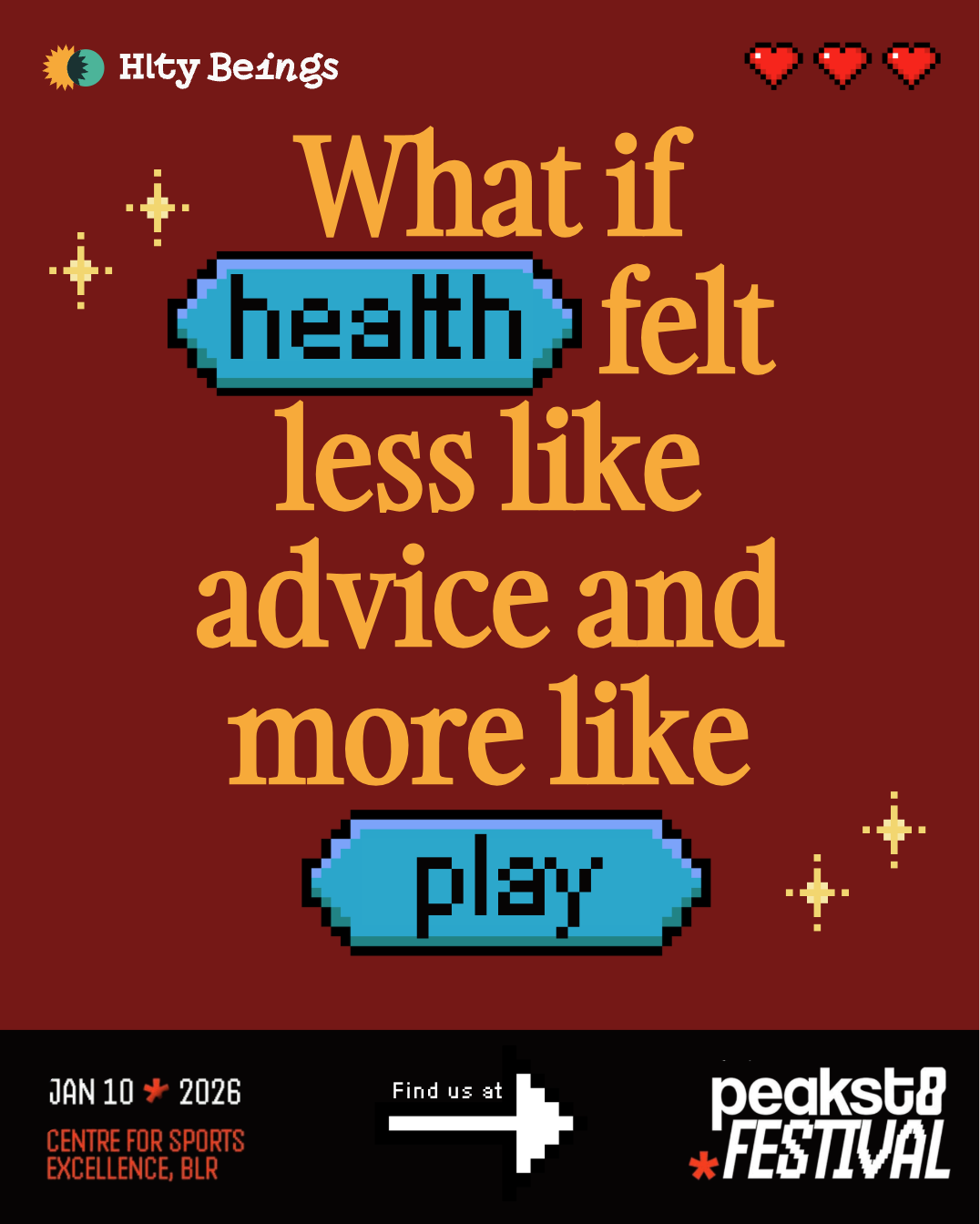
Event communication: health through play 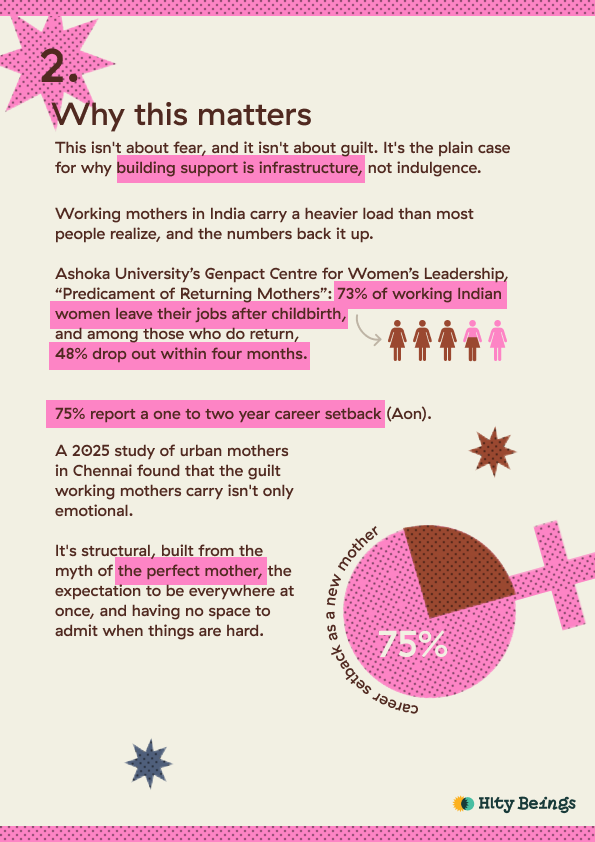
Superwoman resource: visualising the need for support 
Clinical communication: doctor catalogue 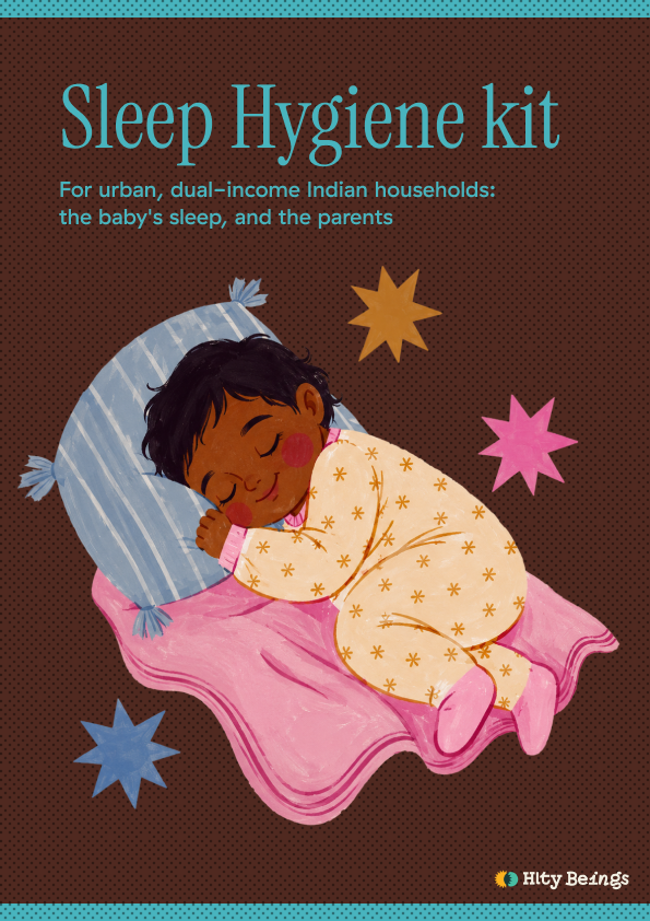
Resource cover: Sleep Hygiene Kit 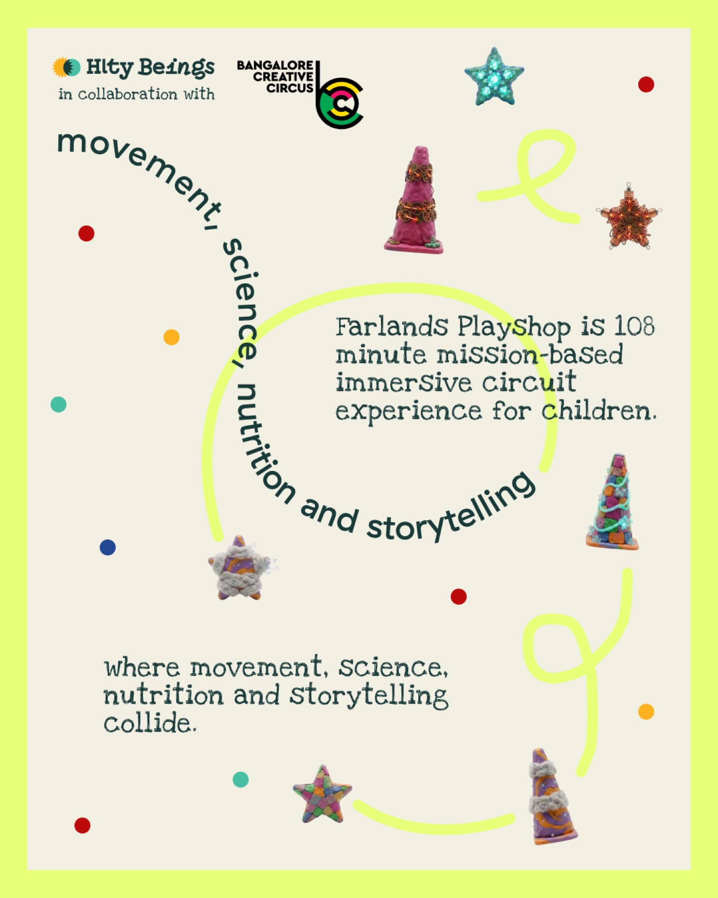
Farlands: explaining participation 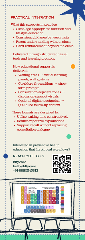
Clinical communication 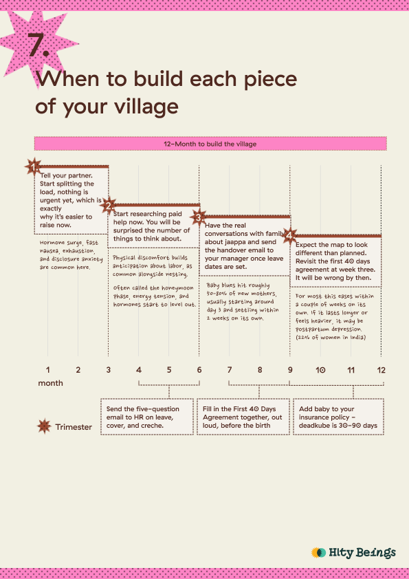
Superwoman resource: planning a village of support 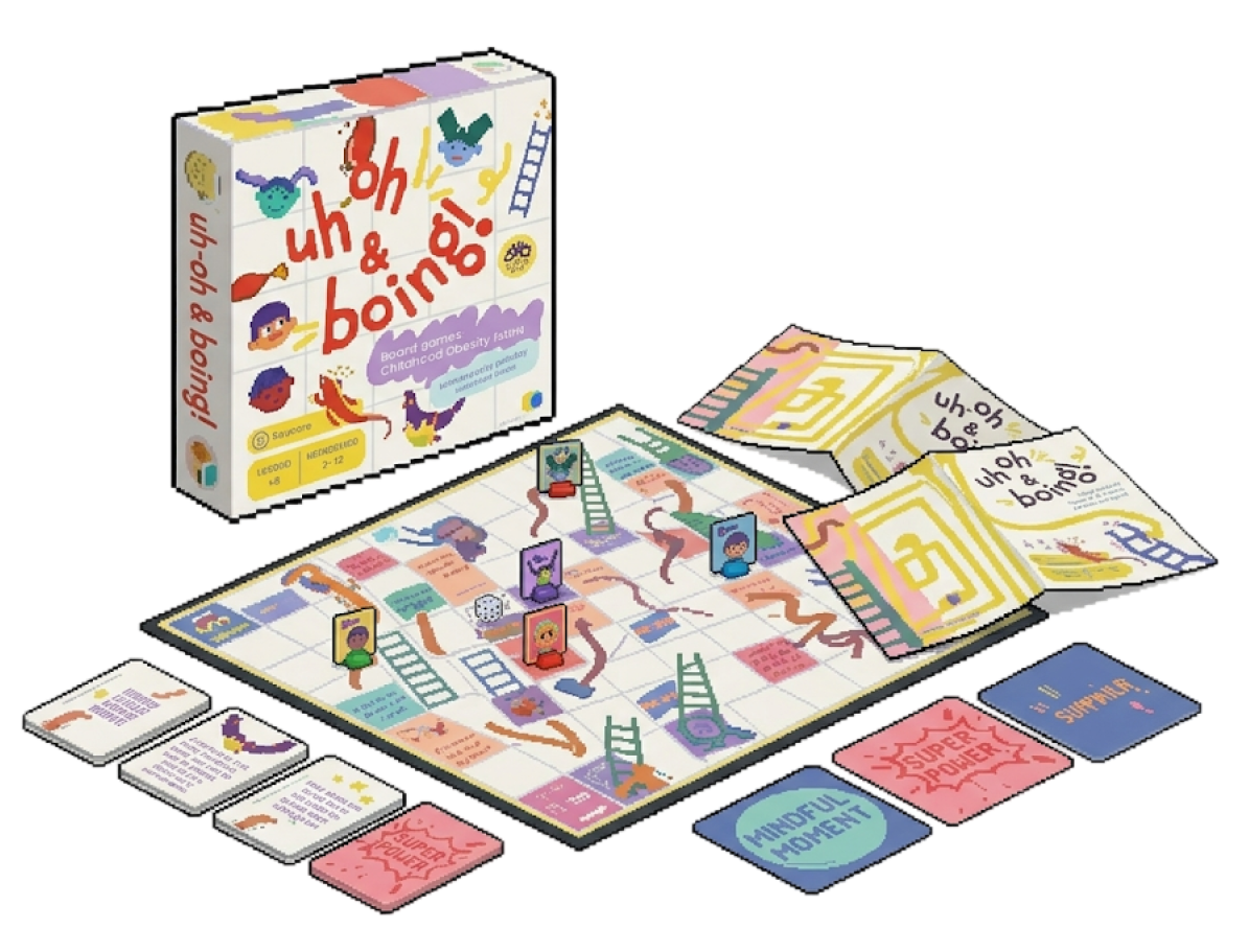
Uh-oh & Boing: board, cards and packaging 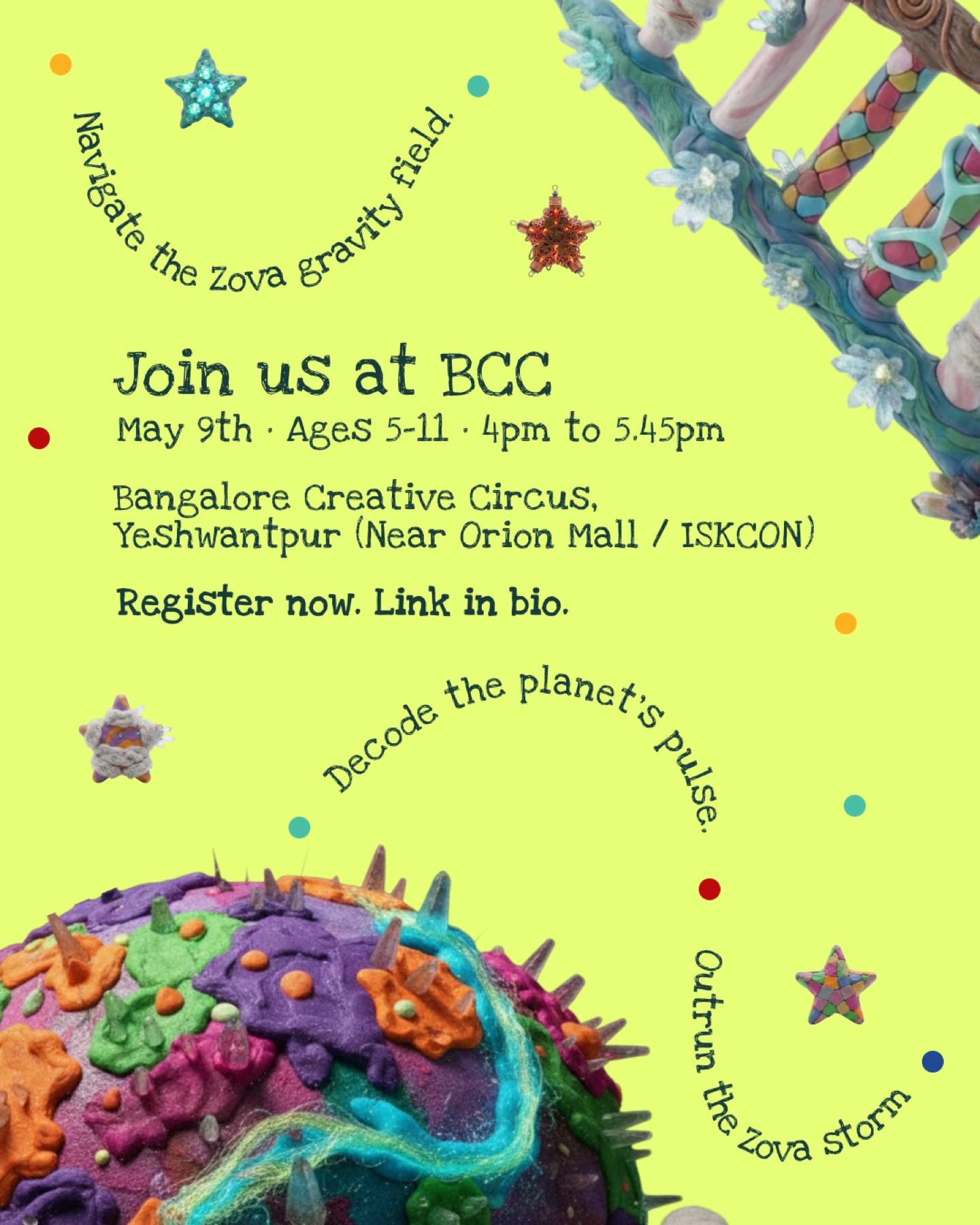
Farlands: invitation and registration 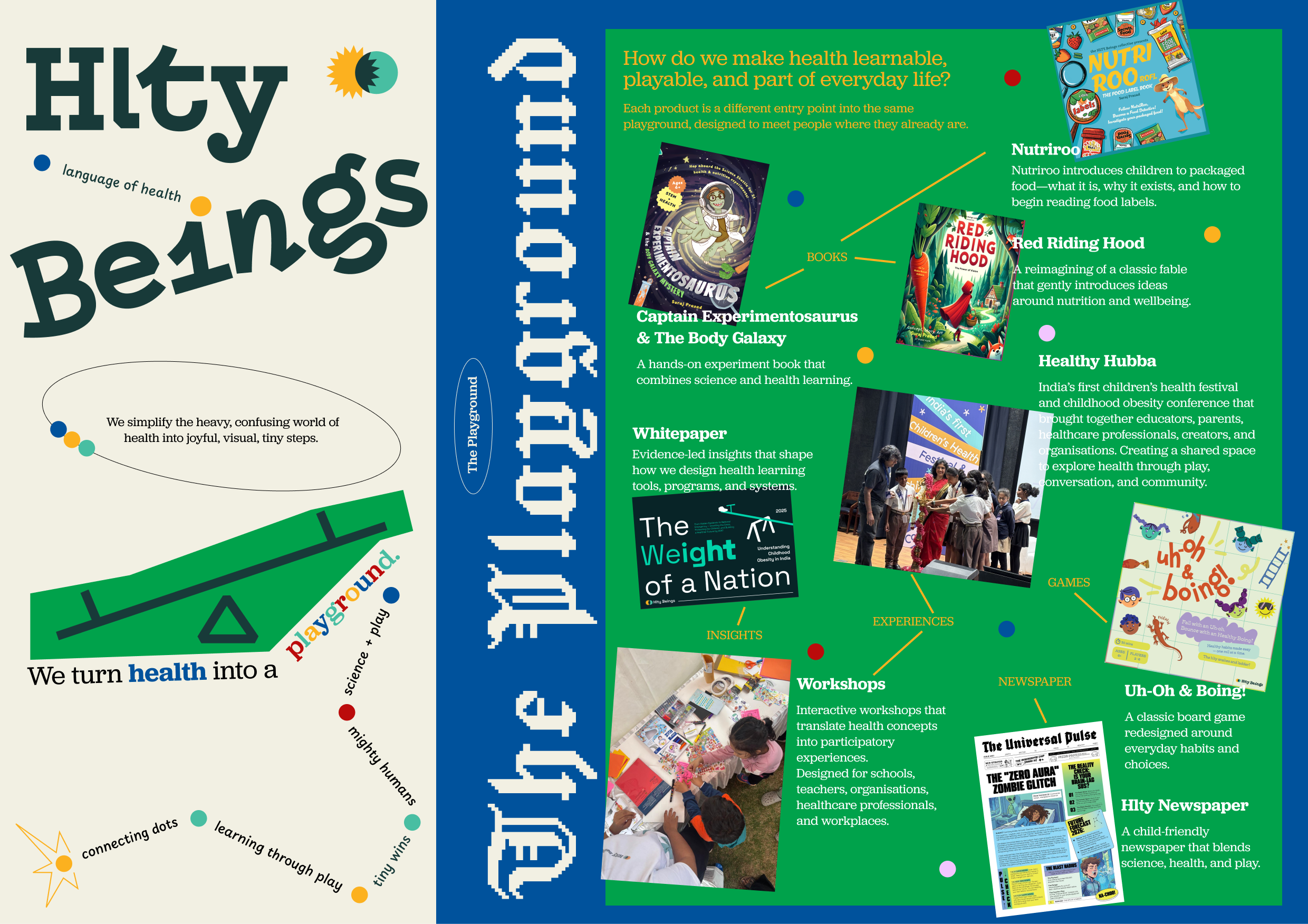
Venture brochure: explaining the offerings
05 / Reflection
Still finding where to focus.
Working closely with the founder gave me a clearer view of the messy early stages of a startup. Products, audiences, and the business model were taking shape together. I learned to weigh what mattered to parents, partners, and investors while trusting my own judgement. It showed me what design can contribute when it has a seat at the table early.
With several offerings and audiences in play, I also learned to ask what the team could sustain well. More products have since been built, and we’re still finding where to focus.
I’d like to see Hlty build a community around health. The people around us shape how we care for ourselves, and shared activities could give families more reasons to play, move, and spend time together.