
Creative direction / Exhibition design / Website design
Designing a festival around children’s health.
- Role
- Creative direction & design
- Scope
- Website & event assets
- Collaboration
- Brand designer
- Audience
- Children & familiesEducators & health professionals
TL;DR
Healthy Hubba was a children’s health festival and childhood obesity conference, developed by Hlty Beings in partnership with Solutionec and held at IISc Bengaluru. The team took it from naming to the event itself in two months.
I worked across creative direction, the website, and Hlty Beings’ learning displays, collaborating with a brand designer on the festival’s wider brand assets.
My contribution
- Website
- Designed the website to introduce the festival and help visitors find its programme, ticket links, and practical details in one place.
- Creative direction
- Shaped the festival’s concept and how it was communicated across the website and event experience, with a focus on making children’s health approachable through learning and play.
- Hlty Beings assets
- Designed the structure and visual presentation of Hlty Beings’ learning displays to give each topic a clear focus. Collaborated with the brand designer on the festival’s wider brand assets.
01 / Opening up the brief
Bring families into the conversation.
The brief centred on childhood obesity, with a conference as its starting format. I wanted to make the subject approachable for children and families, and give them ways to engage with health through participation.
I advocated for a broader children’s health festival, with the conference as part of it. The festival brought discussion together with learning displays, activities, and play, giving families different ways to take part.
02 / Information & activities
Give the information a structure.
Hlty Beings’ Knowledge Zone was an area of the festival where children could explore health topics through displays and activities.
To keep each topic focused, I worked out what information each panel should retain and how to organise it. Layout, visual hierarchy, and graphics gave the information a clear reading order.
The food-label panel centres an enlarged label, with coloured highlights linking its sections to their explanations. The nutrition table uses repeated entries and category colours to organise a larger set of information.
The brand designer developed the festival’s identity. We worked together to carry its visual language across the displays and wider event assets.
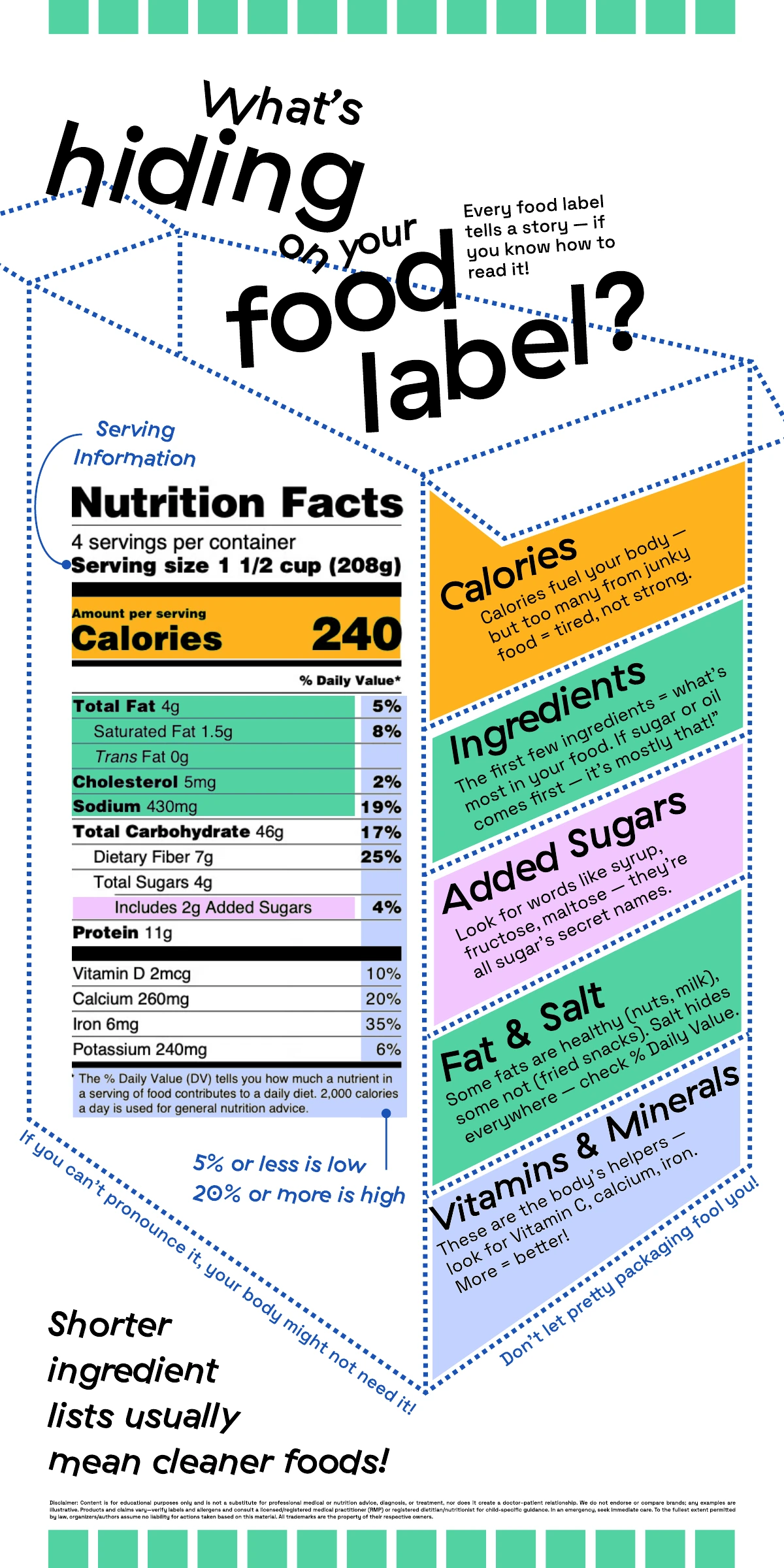
Reading a food label 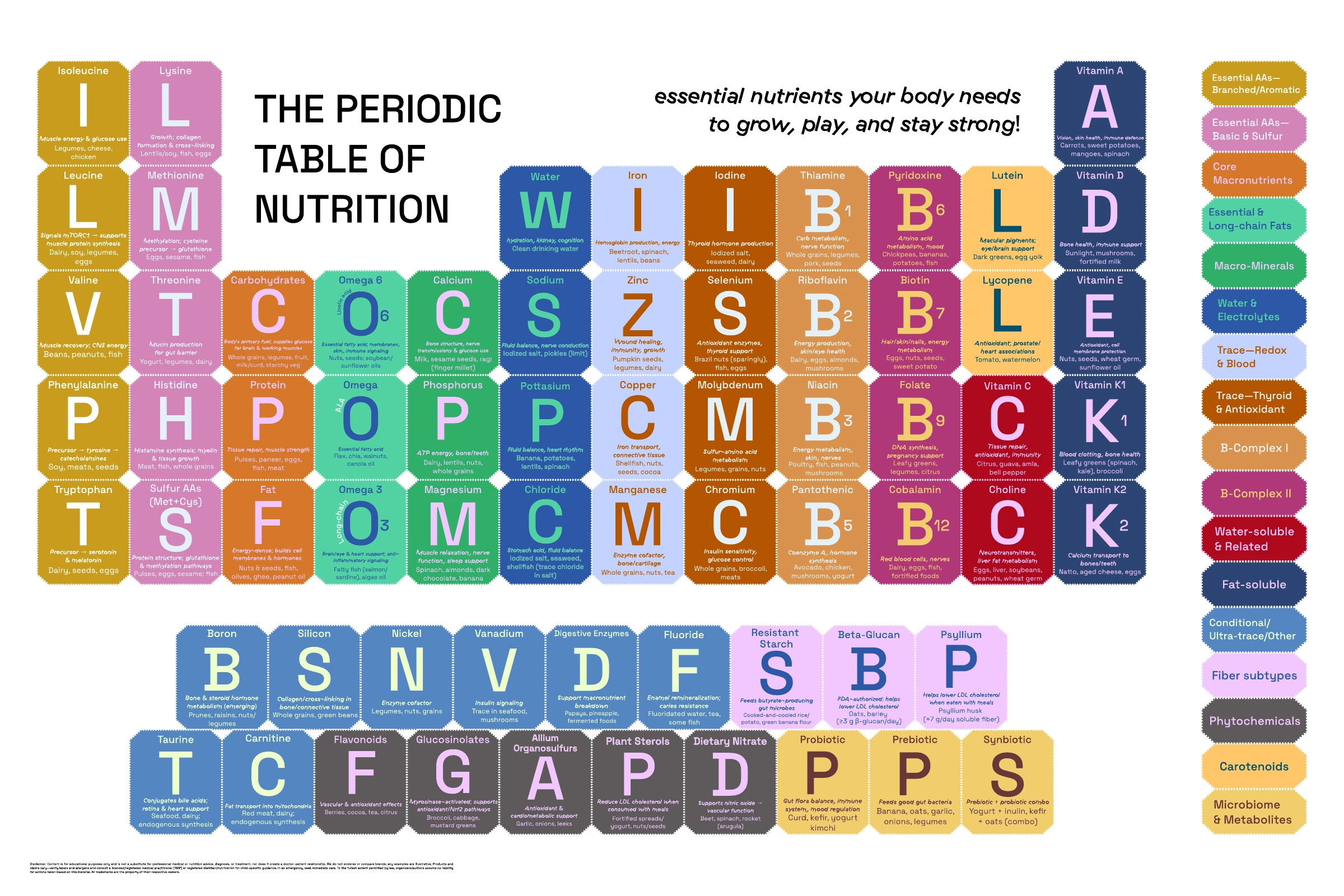
Periodic table of nutrition 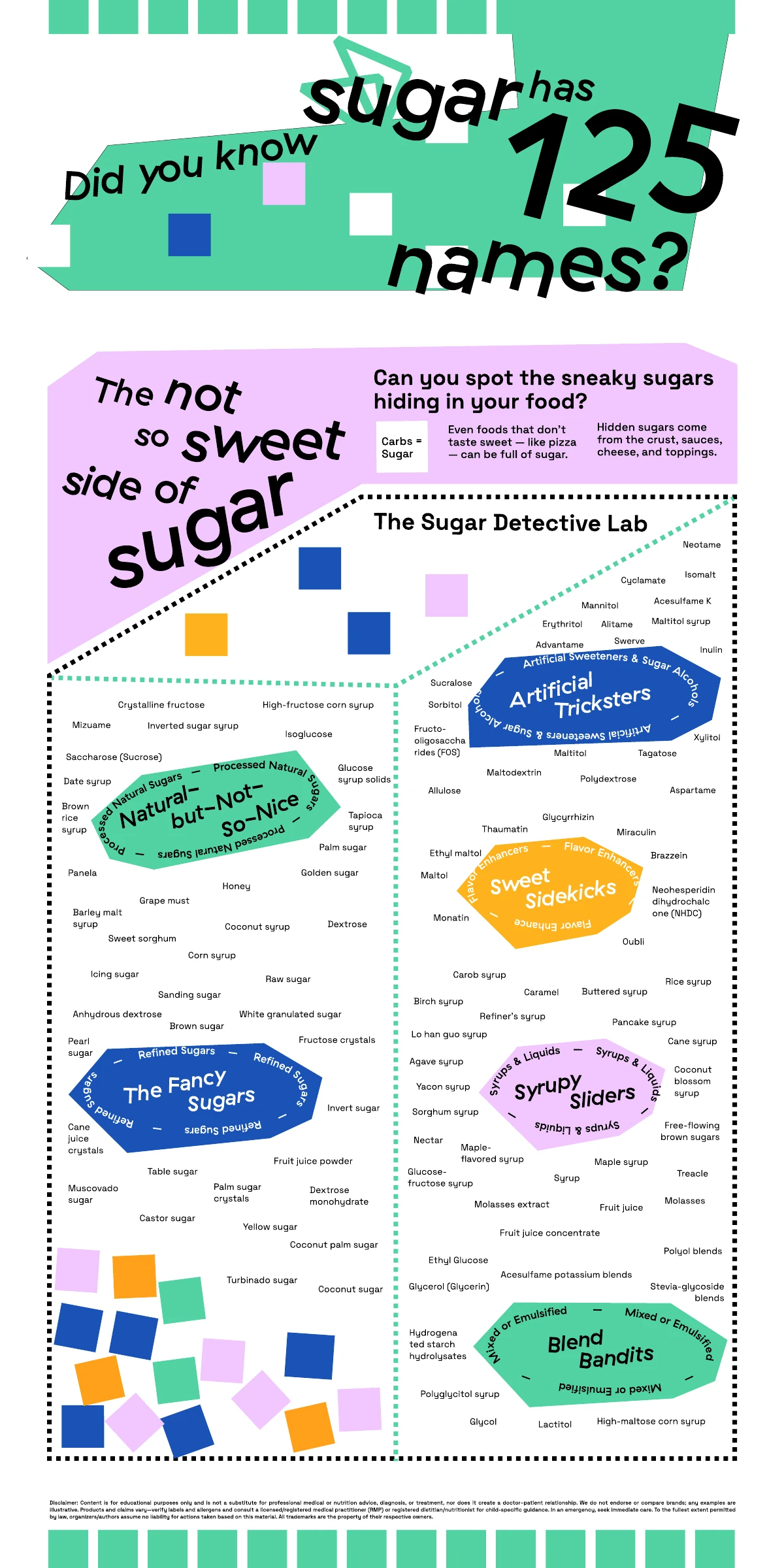
Sugar detective lab 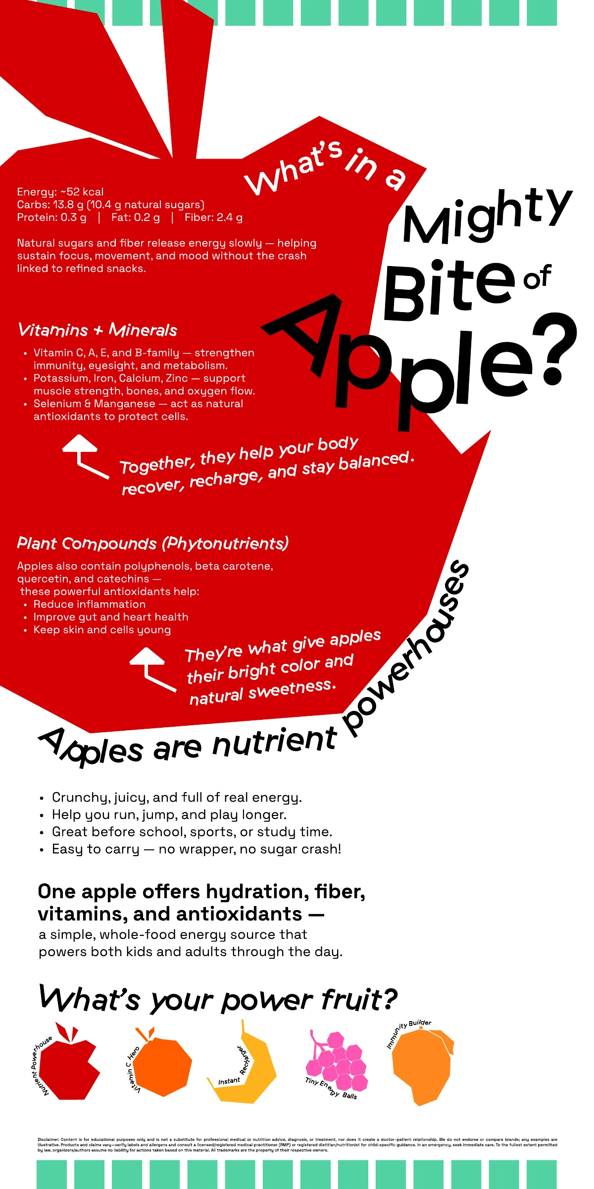
The mighty bite of an apple 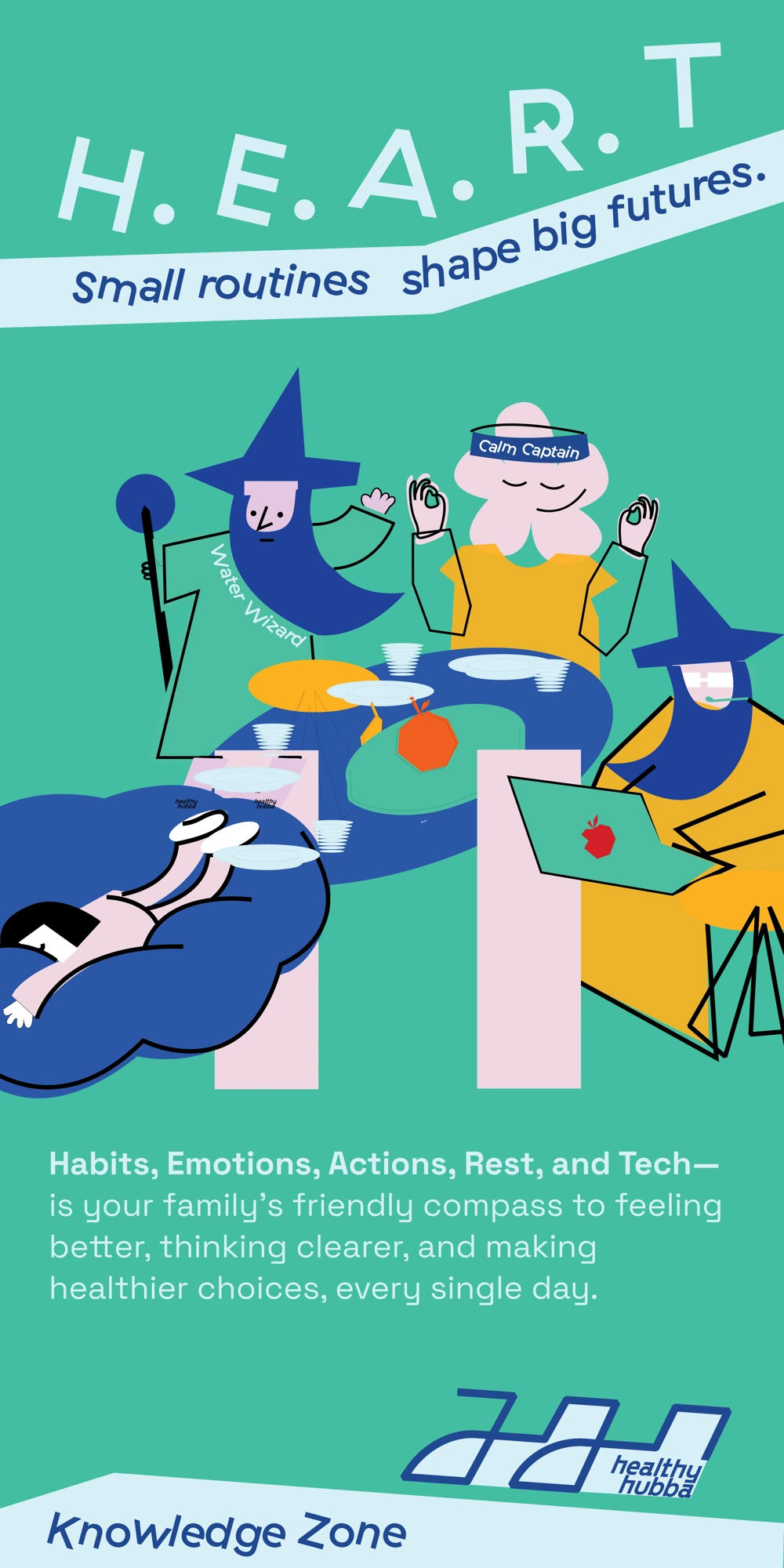
H.E.A.R.T. 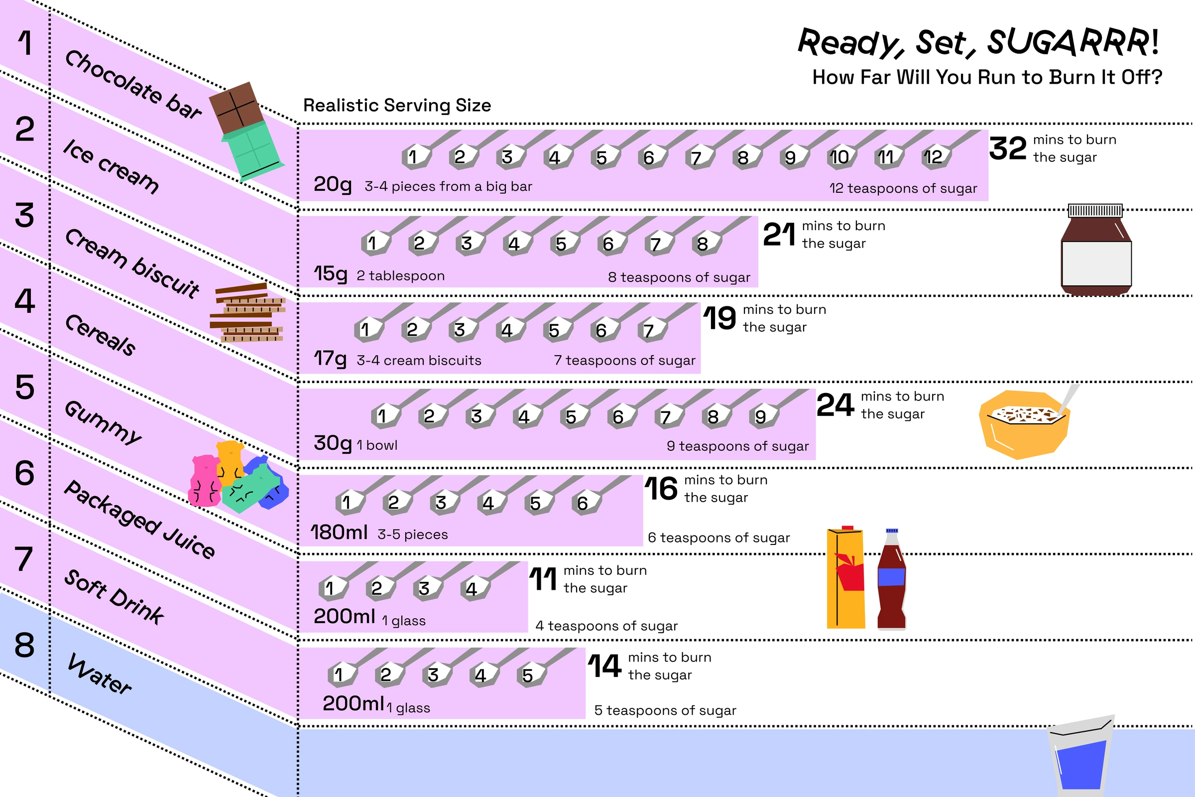
Ready, set, sugarr! 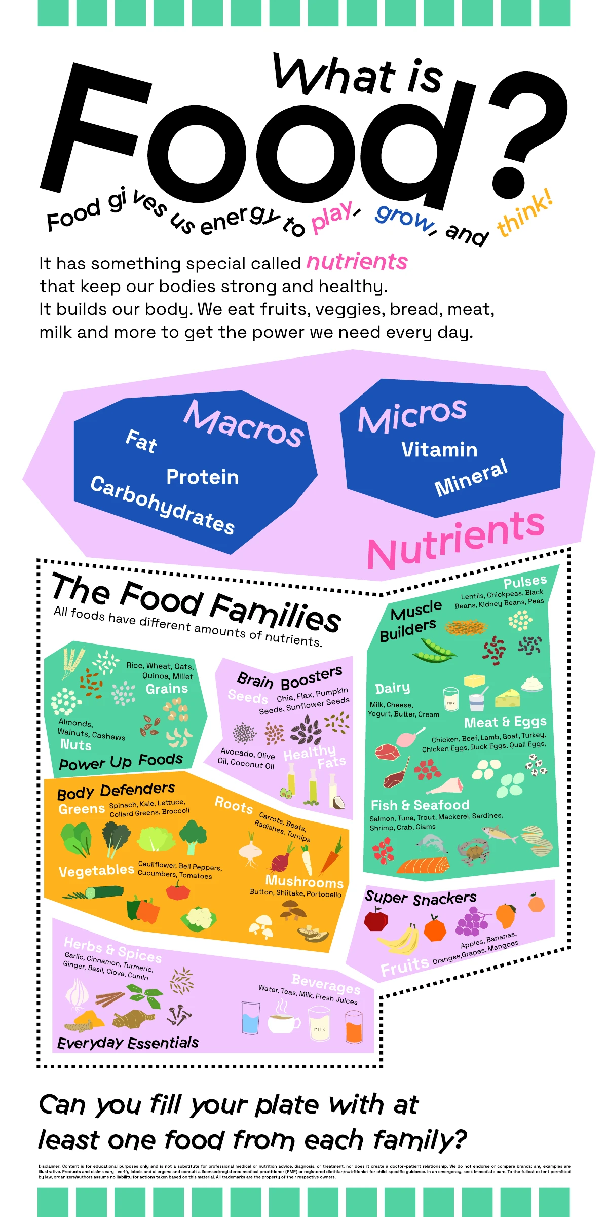
What is food? 
Prevention meets play 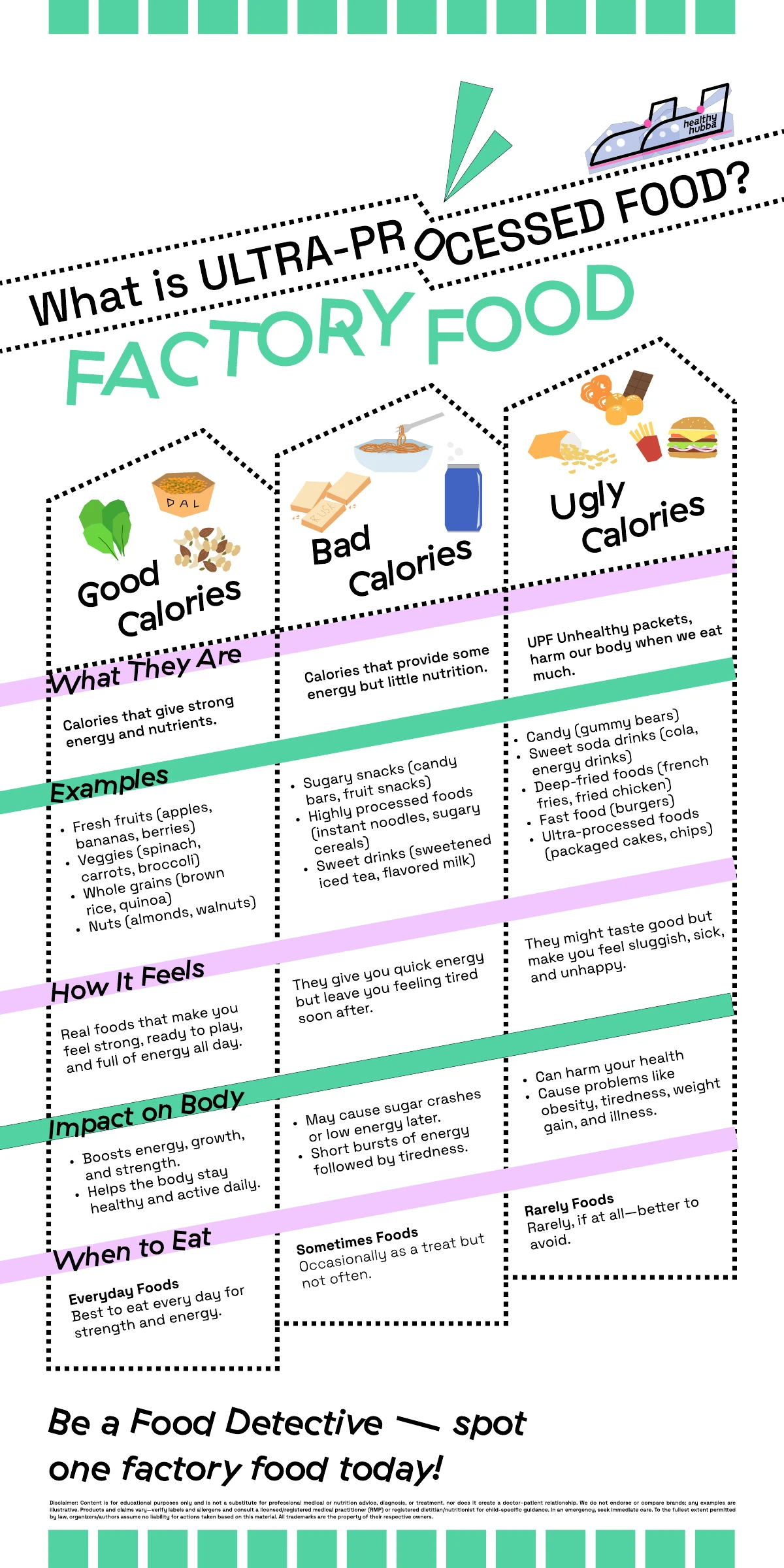
Food processing
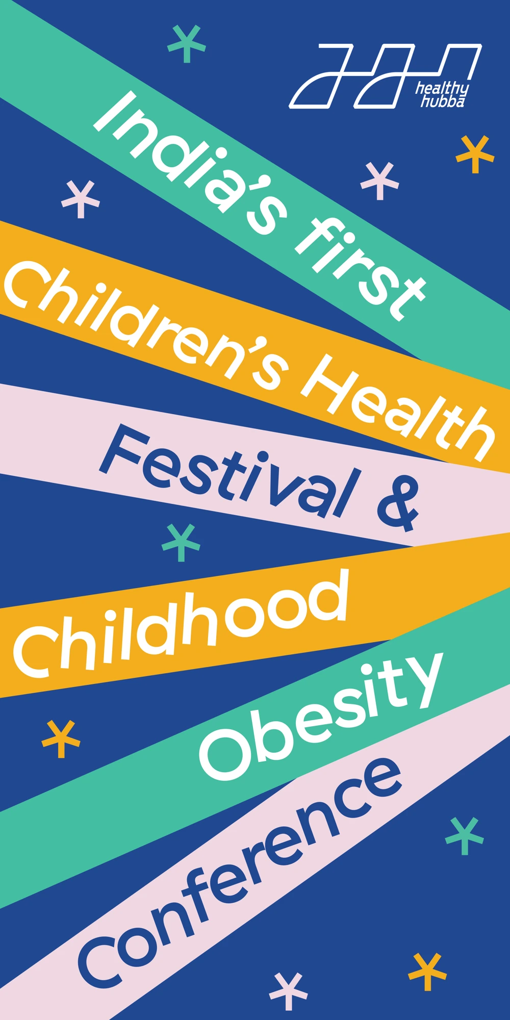
Festival announcement 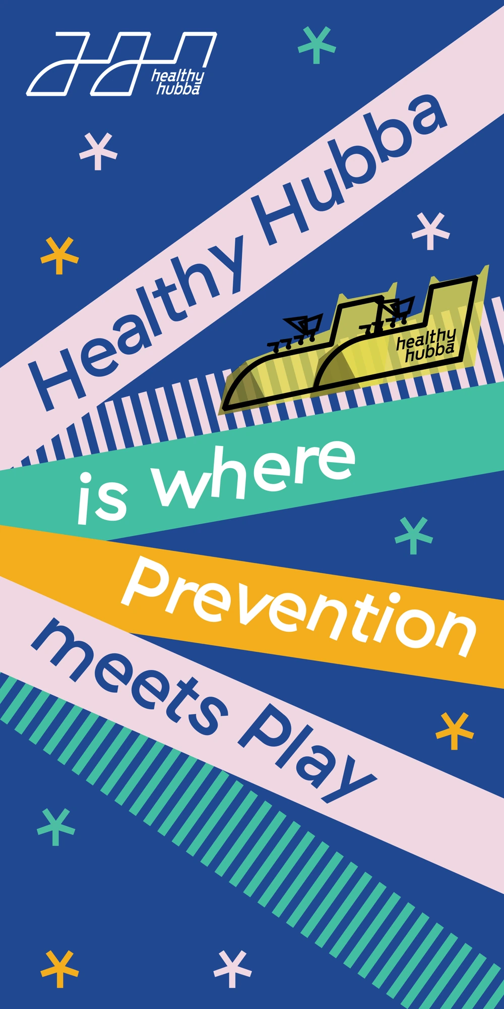
Prevention meets play 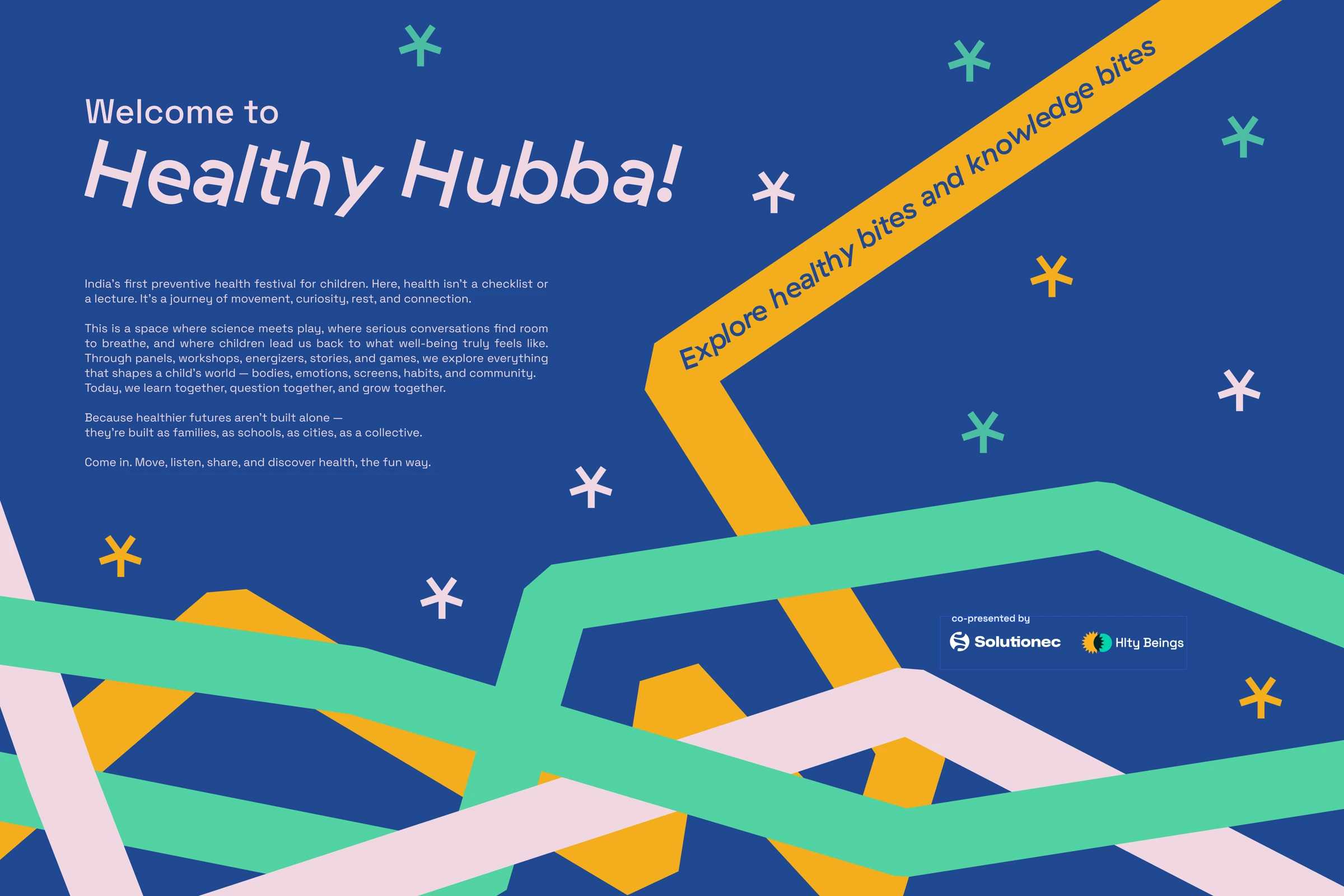
Welcome to Healthy Hubba 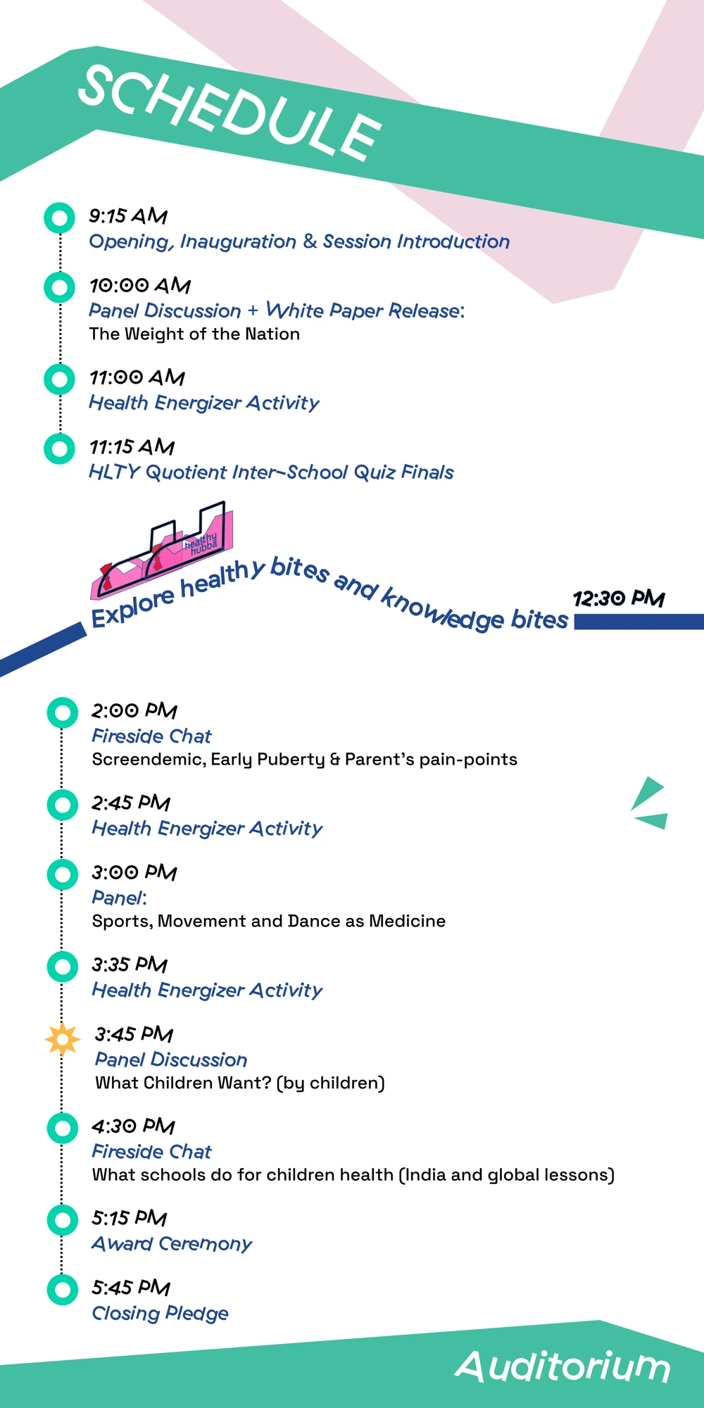
The event schedule 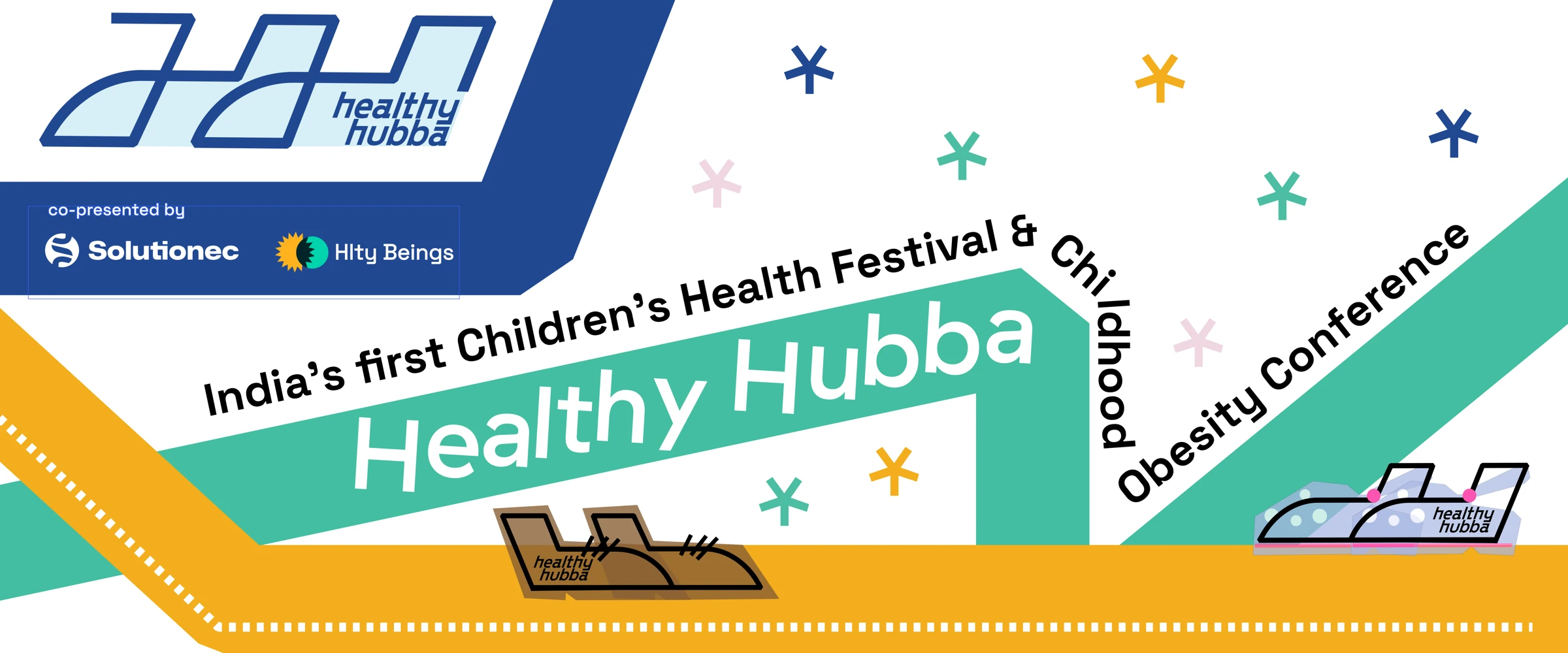
Festival and conference banner 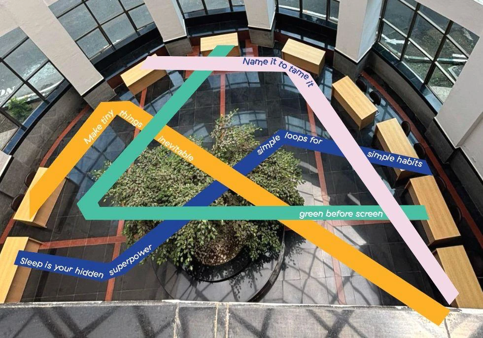
Collaborative floor-graphics proposal · later implemented
An activity at each stop
Each topic also had a small activity in a passport designed by my collaborator. Children collected stickers at each zone. The passport helped them navigate the space and gave them something to do alongside the displays.
03 / At the event
From design files to a live event.
The team brought Healthy Hubba to IISc Bengaluru within the two-month timeline. The event photographs show the welcome graphic and standees as part of the finished venue.
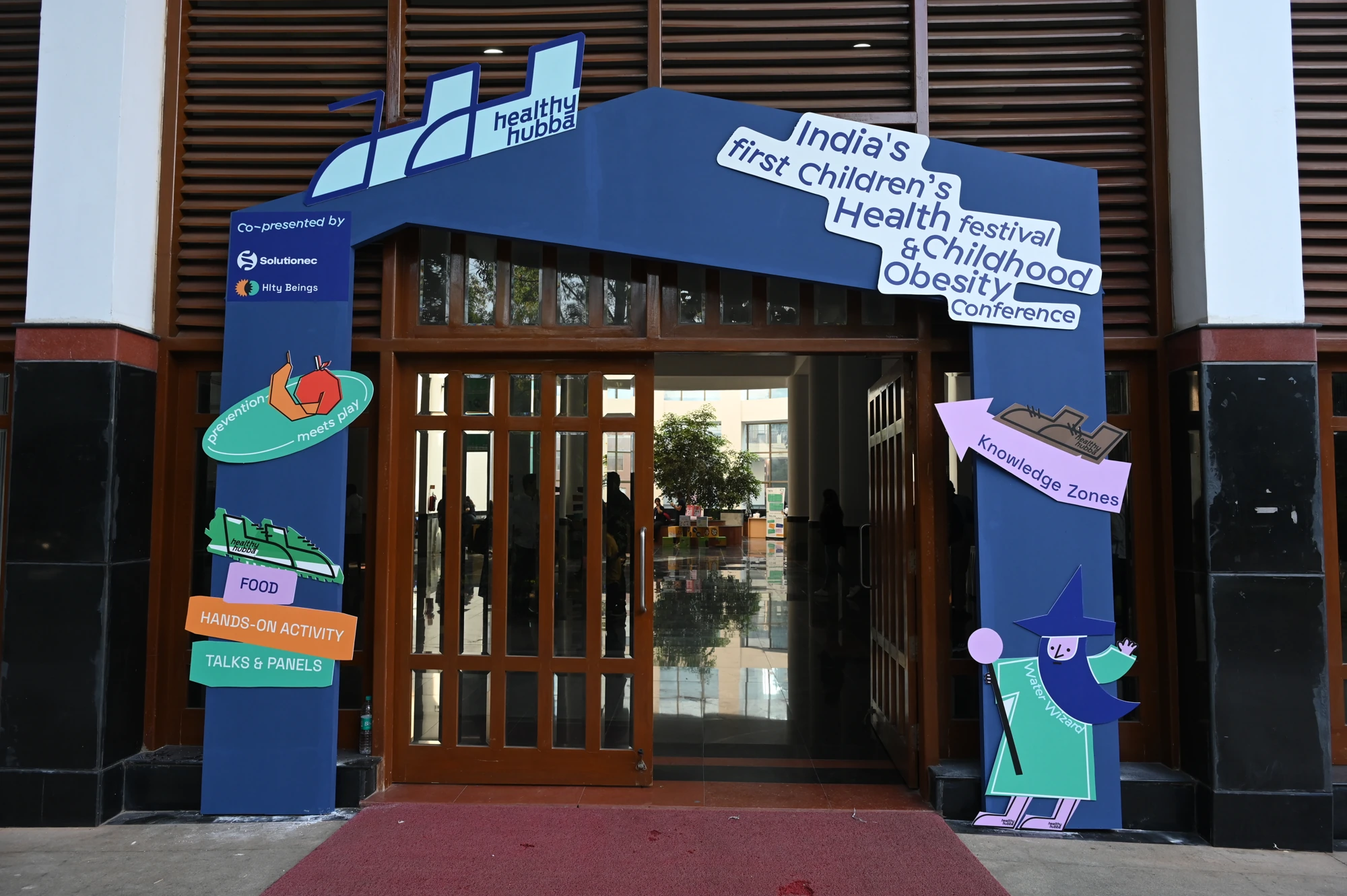
Event entrance · team installation 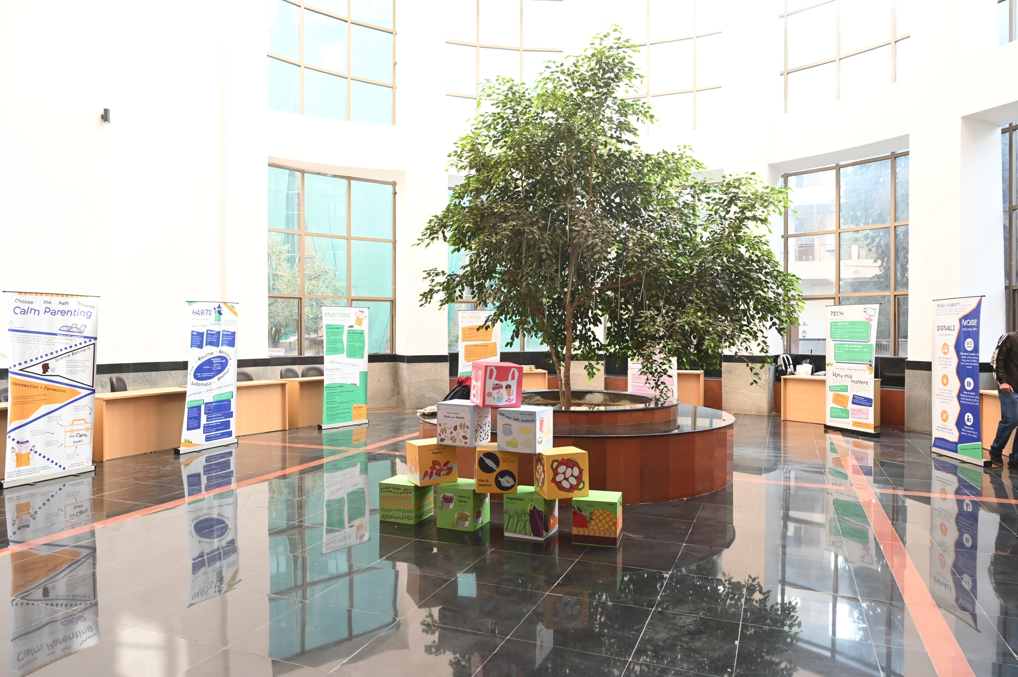
Inside the knowledge zone · team installation 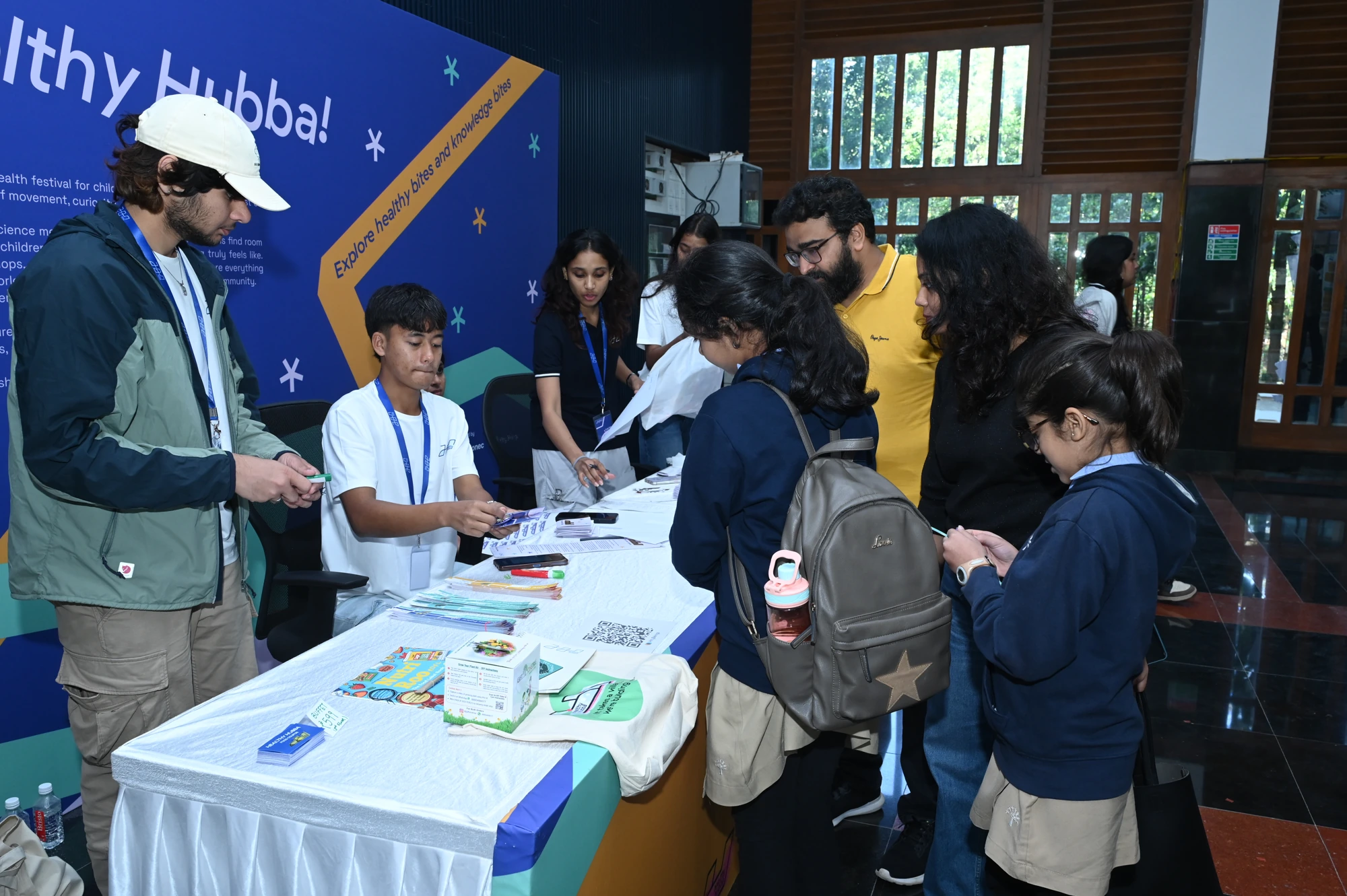
The welcome graphic in place 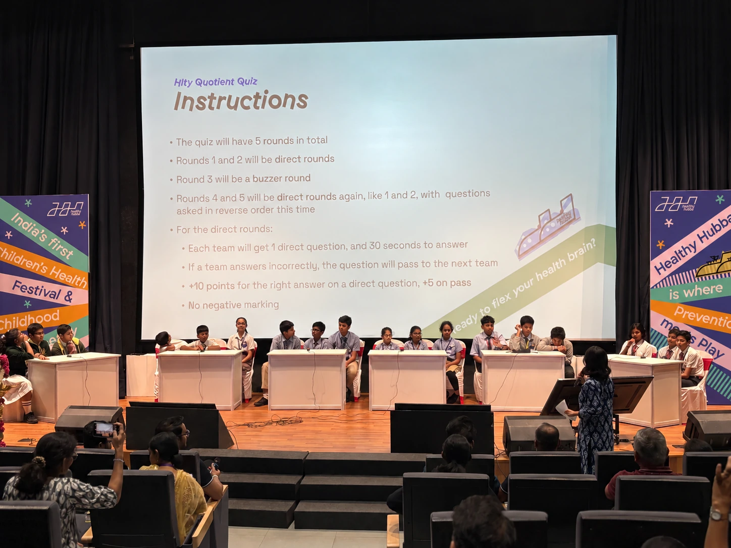
Festival graphics beside the quiz stage
04 / Reflection
Give outreach a head start.
Healthy Hubba showed me how much a team can bring together in a tight timeline. We took the project from naming to the event in two months, and I was encouraged by the turnout given how little marketing we were able to do.
Looking back, marketing needed more time and someone with the right expertise. We didn’t have a marketing specialist on board. For another event, I’d involve one earlier and give outreach more time alongside the design and production work.